
Watercolor on Saunders paper
14 x 21 inches
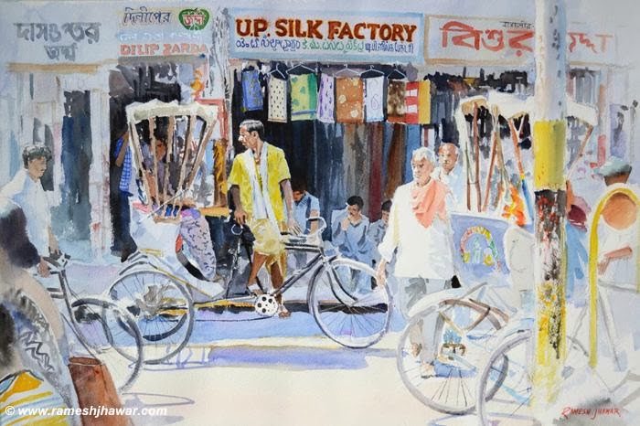
I always love to include the letterings and the sign boards
in my paintings…makes them more interesting! Varanasi is a place where you get
to see( the signboards) and hear a lot of languages as its a very religious and
a very important pilgrimage for all Indians and people from all over the world, not just India, visit the place.
I’ve tried to keep the focus on the main figure, the rickshawallah
by blurring other portions in the painting.
Below is a small sketch in pen and watercolor of the same scene

Hi Ramesh
ReplyDeleteThanks for stopping by my blog and sharing how you work. It is interesting to hear how other artists pursue their regimen of painting. It is interesting to see how our work has changed over the years. I see that we are both experimenting with a more saturated colour palette. I must say that I still prefer working in low chroma with lots of greys, but it is valuable to try all different ways. I really liked your Lanes of Varanasi 1. It has a strong composition and subtle colours. This piece works really well even with all the activity because you have managed to keep the main figure the focus as you mentioned.
I think there are fewer people coming by to comment because of other tech interfaces such as facebook etc. As great as facebook is for connecting people, it is too easy to just press the like button rather than leave a comment.(I am guilty of that as well) Before all the artists in our virtual community jumped on facebook, we spent more time on our blogs which is a more "serious" forum for exchanging ideas. Those are my thoughts anyway!
I think you should paint that view from your window. It has some nice colour with that bit of blue mixed with the greys. Something to do on a rainy day! :-)